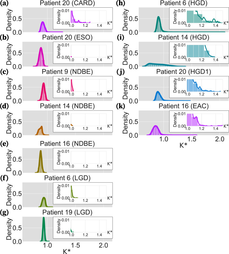
Fig. 4. Distribution of the K* indices for all genes in each biopsy.
Each panel illustrates the distribution curve of the K* indices calculated by phylosignal for all the genes in a biopsy. In each panel, the x-axis and y-axis are the K* index values and their density, respectively. The left panels are the distribution curves of the healthy, NDBE, and LGD biopsies (a–g). The distribution curves of the HGD and EAC biopsies are shown on the right panels (h–k). Inserts within each panel magnify the bars and curve for 1 < K* < 1.5. Each patient’s curve is shown in a different color for better distinction. Source data are provided as a Source Data file.

