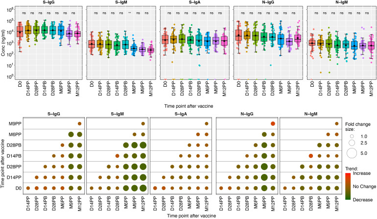
Figure 3.
Boxplots illustrating the concentrations of S-and N-directed antibodies and their corresponding fold changes. Figure 3 shows box plots representing the mean values (dots), medians (horizontal lines), and interquartile ranges (top and bottom of the box) for spike- and nucleoprotein-directed IgG, IgM, and IgA antibody concentrations over time. The x-axis represents the timeline for specimen evaluations, beginning with the baseline (D0), followed by 14- and 28-days post-prime (14PP and 28PP), 28 days post-boost (28PB), and then at intervals of 6-, 9-, and 12-months post-prime (M6PP, M9PP, and M12PP). The y-axis represents concentrations of the respective antibodies in mg/ml Corresponding fold changes in antibody concentrations are visually presented as median fold changes between consecutive time points, with an increase in red shading and a decrease in green shading. The size of the circle corresponds to the magnitude of the change. Insignificance is denoted by p-values greater than 0.05, represented as “ns” (ns; not significant). Statistical significance is indicated by ** (p < 0.01).

