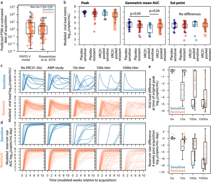
Fig. 5. Modeled acquisition time, viral load metrics, and simulations of viral load and reservoir size during future high-titer trials.
a Predicted titer (PT80) at estimated date of infection using our model compared to a published infection timing approach50; orange and blue dots indicate resistant (N = 84) and sensitive (N = 11) isolates, respectively, from VRC01 recipients with available timing estimates. The maximum measured concentration divided by the minimum observed IC80 is shown as a dashed horizontal line to contextualize a theoretical upper bound on PT80s. b Model estimated metrics for the following treatment and resistance groupings: placebo sensitive (navy; N = 17), placebo resistant (red; N = 45), VRC01 pooled sensitive (blue; N = 9), and VRC01 pooled resistant (orange; N = 87). Each dot represents a participant model value and box plots indicate median, IQR (box) and 1.5x IQR (fliers) across participants. The p-values are two-sided and unadjusted for multiple comparisons, and were obtained from a linear regression model adjusting for protocol and study geographic location. Model peaks were not statistically compared. c Modeled longitudinal viral loads from all VRC01 recipients split by sensitive (blue lines) and resistant (orange lines) viruses. d Modeled longitudinal HIV “reservoir size” (assumed proportional to viral load area under the curve) from all VRC01 recipients split by sensitive (blue lines) and resistant (orange lines) viruses. In c, d from left to right panels indicate counterfactual of participants without VRC01, AMP participants as in the actual trial, and 3 different levels (10x, 100x, and 1000x) of higher-potency trials. There are fewer lines in some plots because the modeled higher potency scenarios sometimes completely suppress viremia below limit of detection. e Differences between AMP study and other modeled scenarios. Viral load difference is calculated by subtracting off (on log10 scale) the peak AMP study viral load from each theoretical scenario in c where viral load is calculated at the original time of peak relative to acquisition. Reservoir size difference is calculated by subtracting off the week 4 AMP study viral load from each theoretical scenario in c where viral load is also calculated at week 4 relative to acquisition. Each dot indicates a participant’s difference (on log10 scale) from each new scenario relative to their baseline (AMP study) value. Box plots indicate median, IQR (box) and 1.5x IQR (whiskers), calculated from VRC01 pooled sensitive (blue; N = 9), and VRC01 pooled resistant (orange; N = 87). In all panels, box plots indicate median, IQR (box) and 1.5x IQR (fliers).

