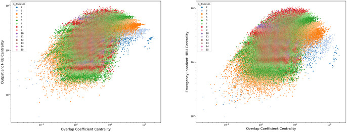
Fig 2. The centrality of the overlap coefficient weighted hypergraph (x-axis) plotted against the centrality of the HRU hypergraph (y-axis).
Each point represents a set of diseases. The colour of the point represents the number of diseases in the set. Left: Outpatient services. Right: Unplanned inpatient services.

