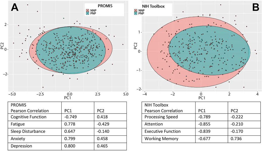
FIGURE 2:
Principal component analyses of quality of life and cognition in PNP and NNP patients. Principal component analyses for (A) PROMIS quality of life measures and (B) NIH toolbox cognitive tests in PNP (green triangles) and NNP (red dots) patients. Ellipses representing the 95% confidence interval encompassing PNP (green) and NNP (red) groups are shown. Pearson correlation tables indicate that patient experiencing the worst quality of life on (A) all PROMIS domains, and who have the worst results on (B) all NIH toolbox cognitive tests, are located on the right distal part of the plots on the PC1 axis whereas those with (A) best quality of life and (B) best cognitive results are located on the left on the PC1 axis.

