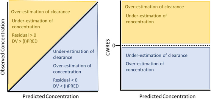
FIGURE 1.

Visuals of GOF plots and what biases may be elucidated on these plots. The left plot illustrates interpretations from the visual evaluation of a (population or individual) predicted concentration versus observed concentration GOF plot. Data that fall above the line of identity (yellow region) will generate a residual greater than zero, implying that the observed concentration is greater than the predicted concentration. This means that the model provided an overestimation of clearance or an underestimation of the predicted concentration. Data that fall below the line of identify (blue region) will generate a residual less than zero, implying that the observed concentration is less than the predicted concentration. This means that the model provided an underestimation of clearance or an overestimation of concentration. These colors and their implications are consistent when reviewing the right plot, which displays a graph that evaluates the concentration versus CWRES. CWRES, conditioned weighted residuals; DV, dependent variable; GOF, goodness of fit.
