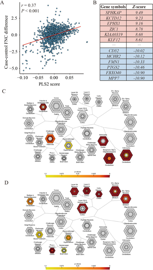
Fig. 6. Gene expression profiles related to FNC differences and the results of enrichment analyses.

A Scatterplot represents the relationship between PLS2 score and case–control FNC differences. Each point denotes a tissue sample. B Ranked PLS2 genes based on Z-score. C Cell type-specific expression analyses using the PLS2+ gene list. D Cell type-specific expression analyses using the PLS2- gene list. Colored cell types represent significance after multiple testing correction. The sizes of the hexagons denote cell-type specificity across different specificity index probability (pSI) statistic thresholds ranging from 0.05 to 1e-4. The outer hexagons correspond to the least specific test for a cell type (pSI threshold = 0.05), whereas the innermost hexagon reflects the most specific test for a cell type (pSI threshold = 1e-4). FNC functional network centrality, PLS partial least squares.
