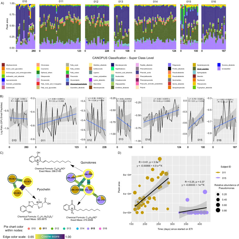
Fig. 4.
Metabolome dynamics of subjects on ETI therapy through time of sampling. A Bar plots representing the metabolome’s normalized peak area of longitudinally collected sputum samples from seven subjects on ETI. The sample collection time point (beginning and end of days) per subject is displayed, while gaps across sampling are not shown. B Line plots represent the GLP:small peptide log-ratios. C Molecular networking displaying Pseudomonas-like molecules from sputum samples of subjects on ETI. Nodes in yellow denote those molecular features annotated by GNPS. D Scatter plot representing the molecular dynamics between selected Pseudomonas metabolites, the time in days since subjects 011 and 015 started on ETI, while the size represents the relative abundance of Pseudomonas at the time of sampling over time

