Figure 2.
Depicting tissue-scale subpopulation abundance at single-cell resolution
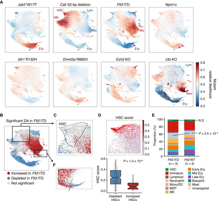
(A) Differential abundance landscapes of eight preleukemic mutant models. Higher likelihood (red) corresponds to higher abundance and lower likelihood (blue) to lower abundance in each mutant model compared with paired wild-type samples. All results are presented in the same color scale ranging from 0.2 to 0.8 for comparability. Cell types with a median mutant relative likelihood of >0.6 or <0.4 are indicated.
(B) Statistically significant differential abundance (DA) in the Flt3 ITD model. p values were derived using a two-sided t test. Cells with raw p values < 0.05 and BH-adjusted p values < 0.25 are colored red (abundant) or blue (depleted in the Flt3 ITD model).
(C) A magnified section of the HSC cluster region. The boundary of the HSC cluster is outlined with dashed lines.
(D) Top: the HSC score in the Flt3 ITD and wild-type HSCs. Bottom: significant difference in the HSC score between Flt3 ITD-depleted (mutant relative likelihood < 0.4) and increased (mutant relative likelihood > 0.6) HSCs. Boxplots show median and first/third quartiles. The whisker extends from the smallest to the largest values within 1.5 × IQR from the box hinges. The p value is from a two-sided Wilcoxon rank-sum test.
(E) Stacked bar plots showing the cell type proportions in the Flt3 ITD and wild-type animals. Cell types are color coded as in Figure 1B. Statistical significance was determined with two-sided t test.
(F) A magnified section of the neutrophil progenitor cluster region. The boundary between significantly expanded neutrophil progenitors (red) and depleted later neutrophil progenitors (blue) is indicated by a dashed line.

