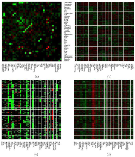
Fig. 1.
Heatmap of blood test data. In Panel (a), the correlation structure of the testing items is shown with green, black, and red colors indicating positive, negligible and negative correlations. Diagonal entries are set to 0. In Panels (b), (c) and (d), the rows and columns are ordered according to K-means with . The columns are the testing items and the rows are patients. In Panel (b), the EHR data is standardized. Green, black and red colors represent values above, near and below the average or the midpoint. In Panel (c), the EHR data is transformed to a categorical matrix based on a trichotomization with respect to a reference range. Green, black and red colors indicate above, within, below the range, respectively. In panel (d), the EHR data is scaled and centered at the midpoint of the reference range (the order of rows and columns is the same as in Panel (c)).

