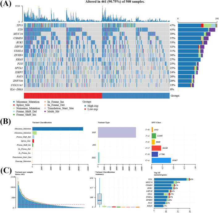
FIGURE 6.

Evaluation of genomic alterations. (A) Waterfall plot shows mutation information for each gene for each sample. Color annotation of various cancer types are shown at the bottom. The barplot above the legend shows the number of mutation burden. (B) Cohort summary plot shows the distribution of variants according to variant classification, type, and SNV class. (C) Bottom part (from left to right) indicates mutation load of each sample (variant classification type). Stacked bar graph shows the top 10 mutated genes.
