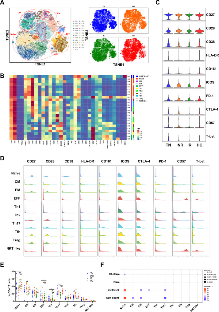
Fig. 3.
Characterization of CD4+ T cell subsets in individuals with chronic HIV-1 infection and HCs. (A) t-SNE map displaying CD4+ T cell clusters based on manual annotation of PhenoGraph clustering. Clusters are circled according to major cell subpopulations (left), and different groups are each colored as indicated (right). (B) Heatmap showing normalized expression of the markers from panel for PhenoGraph clustering. (C) Violin plots showing the expression distribution of selected cell markers of CD4+ T cells among the four groups. (D) Histograms showing expression of indicated markers for major CD4+ T cell subpopulations. (E) Dot plot showing the proportions of major CD4+ T cell subsets across the four groups. Different groups are shown with the same color as in A. C. Significant differences were indicated by *P < 0.05; **P < 0.01; ***P < 0.001. Differences between each group were analyzed using a two-sided unpaired Mann–Whitney U-test. (F) Bubble heatmap showing Spearman’s rank correlation of CD4+ T cell subset proportions with viral reservoir parameters, CD4/CD8 ratio, and CD4+ T cell count. The color of the bubble represents the correlation coefficient, the deeper the more relevant between the two variables, while the direction is indicated by colors: red for a positive correlation and blue for a negative correlation. The size of the bubble indicates statistically significant P-values, with larger values representing greater significance

