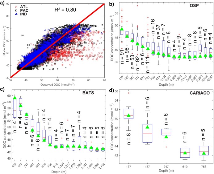
Extended Data Fig. 4. Comparison of model DOC (DOC + DOCr + DOCl) based on SeaWiFS CbPM NPP field to observations.
a, Tracer–tracer comparison for DOC between the observations and the optimal model. Red circles show DOC observations in the Atlantic Ocean, black squares in the Pacific Ocean, blue triangles in the Indian Ocean and green stars in the Arctic Ocean. The red line shows the one-to-one line. The model captures roughly 80% of the spatial variance of the DOC data. b–d, Comparisons of model DOC to those measured at ocean stations at different depths. The in situ DOC measurements are interpolated to the model grid. The numbers above/below each box represent the number of measurements at each depth. The box plots summarize the distributions of in situ measurements, which show the 25th, 50th and 75th percentiles binned according to the DOC concentration. The whiskers cover 99.3% of the data, with the remaining points shown as red crosses.

