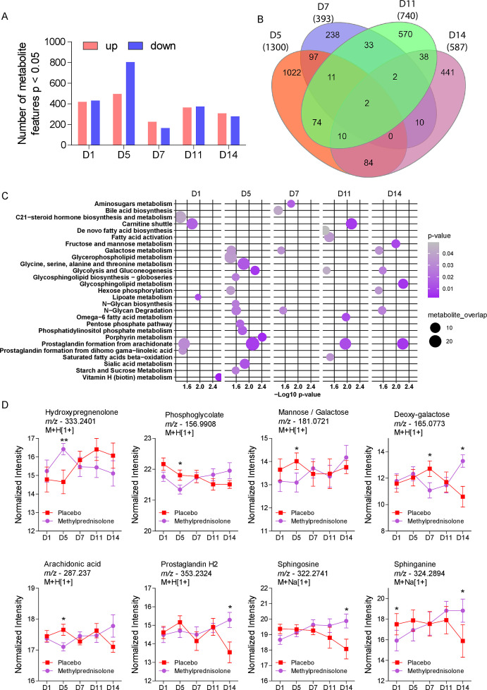
Fig 2.
Longitudinal comparison between placebo or MP-treated COVID-19 patients. (A) Differential abundance of the significant metabolite features found from D1 to D14. (B) Venn diagram of differentially abundant metabolites on D5 to D14. The numerical values are indicative of the number of different metabolites detected at different time points. The color code is illustrative of the time points: D5-Orange, D7-Indigo, D11-Green, and D14-Purple. (C) Pathway enrichment analysis of significant metabolite features for each of the sampling time points. (D) Temporal analysis of the relative abundance of the significant metabolite features detected in the two patient groups at D1 to D14. *P < 0.05, **P < 0.01.

