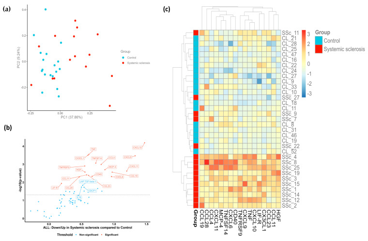
Figure 1.
Targeted proteomic profiling of patients with SSc compared to healthy volunteers. (a) PCA plot of patients with SSc (red dots) and HCs (blue dots). Each dot represents a sample. The percentage of variation accounted for each principal component is shown in brackets along the x- and y-axis labels. (b) Volcano plot representation of differentially expressed proteins in patients with SSc compared to levels in HCs. Each dot represents a protein. A Welch two-sample t-test at a confidence level of 0.95 was performed for every protein. (c) Heatmap of significantly upregulated proteins in SSc samples. Columns represent individual proteins, while rows represent individual samples. Row and column dendrograms show the distance/similarity between the variables. The relative value for each protein is shown based on the color intensity of the Z score, ranging from low (blue) to high (red).

