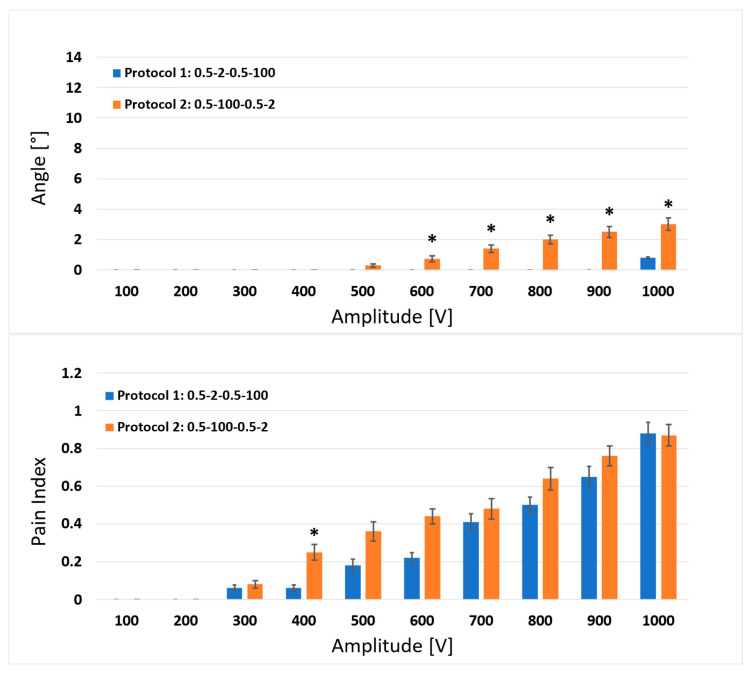
Figure 3.
Comparison of the results between protocol 1 (0.5-2-0.5-100 µs) and protocol 2 (0.5-100-0.5-2 µs) for the muscle response (upper graph) and pain index (lower graph). Each bar represents one pulse protocol (Tp-d1-Tp-d2) for the stated amplitude on the x-axis. The results are shown as the mean value (bar’s height) ± standard error (black vertical bars). The asterisks (*) show statistically significant differences between the pulse protocols at the stated amplitude (p < 0.05).

