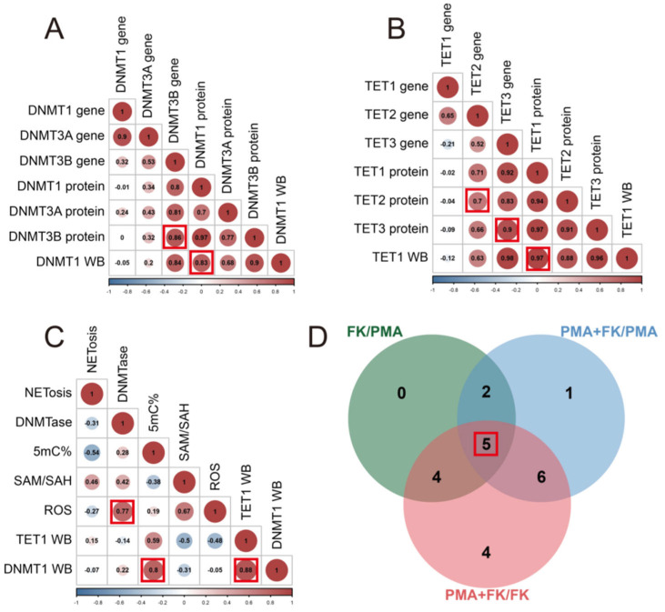
Figure 5.
Correlation and Venn analyses. (A) Correlation analysis among DNMT genes and proteins. The numbers in the circles are correlation coefficients. The numbers represent the number of different indicators. The larger the number, the stronger the correlation. The color and size of the circles indicate the magnitude of the correlation. If the color is blue, this indicates a stronger negative correlation. If the color is red, this indicates a stronger positive correlation. (B) Correlation analysis among TET genes and proteins. (C) Correlation analysis among 5mC% and other data. The numbers in the circles are correlation coefficients. The red box indicates that the correlation coefficient is greater than 0.7 and the number of indicators with the same difference on A, B and C figures. (D) Venn analysis of three comparisons (FK/PMA, FK + PMA/PMA, FK + PMA/FK). The red box indicates the number of indicators with the same difference.

