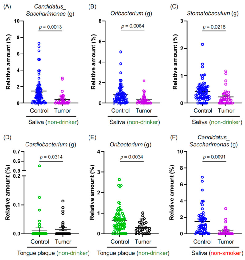
Figure 2.
(A–F) Graphs depict the relative abundance at the genus level, where genera showed significant differences between the indicated groups. Data are presented as mean ± SEM, compared between the two groups using a pairwise Wilcoxon rank-sum test with Benjamini–Hochberg adjustment. Blue: The saliva of controls. Purple: The saliva of cancer patients. Green: The tongue plaque of controls. Black: The tongue plaque of cancer patients.

