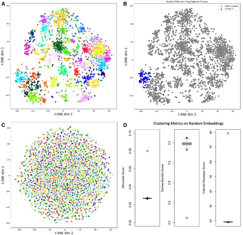
Figure 3.
Visualizing and quantifying similarity within disease clusters. (A) t-SNE projections of the disease embedding vectors were created and plotted, points are colored according to their cluster membership. (B) The same t-SNE projections as in (A) are plotted, but modifying the color coding to highlight a single cluster, in this case, cluster 7. To find all individual t-SNE single clusters highlighted, go to https://doi.org/10.6084/m9.figshare.23748846. (C) t-SNE map of embeddings constructed based on randomly shuffled walks. (D) The distribution of three clustering metrics (Silhouette, Davies-Bouldin, and Calinski-Harabasz) derived from the randomly shuffled embedding models with the real clustering model metrics plotted as single points.

