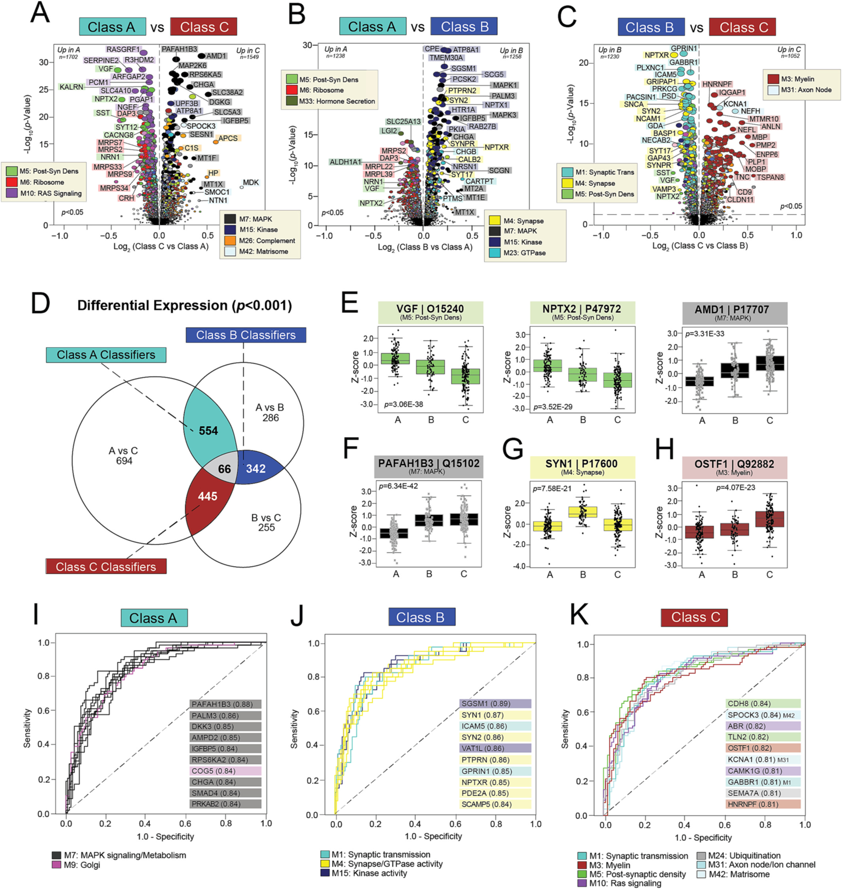
Fig. 5. Differential expression of individual proteins reveals highly sensitive and specific classifiers.

A-C) Volcano plots displaying the log2 fold change (x-axis) against the -log10 statistical p value (y-axis) for proteins differentially expressed between pairwise class comparisons. All p values across pairwise comparisons were derived by ANOVA with Bonferroni post-hoc correction. Proteins are shaded according to color of module membership. (D) Venn diagram of significantly altered proteins (p < 0.001) across pairwise class comparisons. There were 66 proteins with significant changes across all three pairwise comparisons, while hundreds of proteins were significantly altered across two of the three pairwise comparisons. The latter were deemed “classifiers”, as each was uniquely altered in one class relative to the other two. There were 554 Class A classifiers, 342 Class B classifiers, and 445 Class C classifiers. (E-H) Abundance levels (z-score) of select proteins across NCI cases and the three classes. ANOVA p values are provided for each abundance plot. Box plots represent the median and 25th and 75th percentiles, while box hinges depict the interquartile range of the two middle quartiles within a group. Data points up to 1.5 times the interquartile range from the box hinge define the extent of error bar whiskers. The 66 proteins altered across all pairwise class comparisons included neuroprotective markers with well-described links to AD (VGF, NPTX2) and those without known associations to disease (AMD1) (E). Classifiers altered in two of the three pairwise class comparisons included PAFAH1B3 for Class A, SYN1 for Class B, and OSTF1 for Class C (F-H). (I-K) ROC curves of the 10 most sensitive and specific proteins for each class by AUC values, which are included in parentheses. Proteins are shaded according to color of module membership. Abbreviations: Post-Syn Dens, Post-Synaptic Density.
