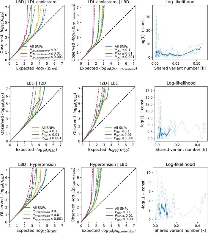
Figure 2.
Conditional quantile–quantile (Q–Q) plots and shared variant estimates. The conditional Q–Q plots show the relationship between the expected (x-axis) versus the observed (y-axis) −log10 P-values of the single nucleotide polymorphism (SNP) associations in the primary phenotype (e.g. LDL cholesterol) stratified by the P-values in the conditional trait (e.g. LBD). We show four strata: all SNPs, SNPs with two-sided P-values ≤0.1 (orange lines), P-values ≤0.01 (green lines) and P-values ≤0.001 (red lines). The dashed, diagonal line indicates the expected Q–Q plot under the null hypothesis for genome-wide associations. The increasing degree of leftward deflection from the null in the conditional phenotypes indicates polygenic overlap. Using MiXeR modelling of polygenic overlap, all three tested traits [LDL cholesterol, Type 2 diabetes (T2D) and primary hypertension] show genetic overlap when conditioned on LBD. The log-likelihood plots illustrate the goodness-of-model-fit, plotting the negative log-likelihood function against the π12 parameter (number of influencing variants shared between two tested traits).

