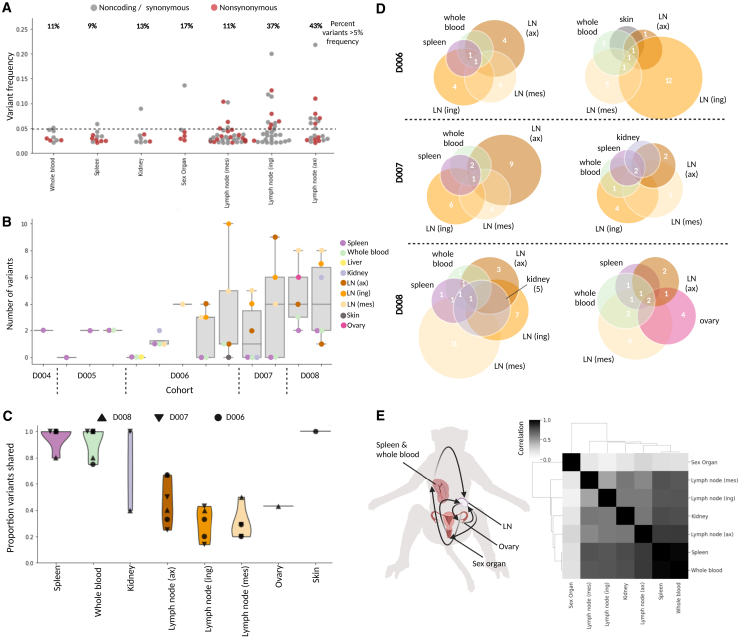
Figure 4.
Minor viral variants show compartmentalization and circulation
(A) Frequencies of all nonsynonymous (red) and synonymous/noncoding (gray) variants that emerged during infection, plotted and separated by tissue; the percentage of variants above 5% frequency (dotted line) is given above each tissue.
(B) For each animal (ordered by DPI), the number of variants that emerged in every tissue (samples with >400× mean viral coverage).
(C) Violin plot showing the proportion of shared viral variants, separated by tissue; each point represents a unique animal, and symbols demonstrate DPI.
(D) Schematic representing variants that are shared (numbers displayed in overlapping circles) and not shared (numbers displayed in non-overlapping circles) in all tissues available for 6 animals (2 of each the D6, D7, and D8 cohorts).
(E) Left: schematic of viral circulation among tissues, based on the variant profiles (image created with BioRender). Right: a Spearman correlation of different tissues’ variant profiles, concatenated across animals.

