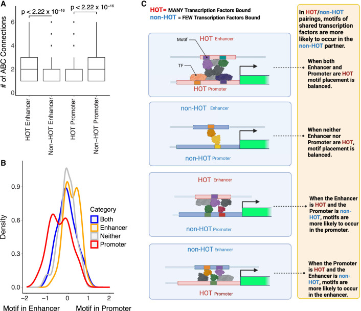
Figure 3.
Looping contributes to shared TF binding between putative enhancers (labeled “enhancer” for plot simplicity) and promoters at HOT sites. (A) Box plot shows the number of loops (y-axis) for putative enhancers and promoters when they are HOT or non-HOT (x-axis). Given that at least one loop is present, HOT putative enhancers have more loops than non-HOT putative enhancers, and non-HOT promoters have more loops than HOT promoters (t-test P-value ≤ 2.2 × 10⁻¹⁶). Boxes represent 25%–75% quartiles with line indicating median, whiskers extend to ±1.5 × IQR (interquartile range) past the boxes, and points are observations falling outside of this range. (B) Density plot of the natural log of fraction promoters with the relevant motif over fraction of putative enhancers with the relevant motif for loops in which a DAP's peak is found in both the putative enhancer and the promoter. Blue indicates that both the putative enhancer and promoter are HOT. Red indicates that only the promoter is HOT. Orange indicates that only the putative enhancer is HOT. Gray denotes that neither are HOT. Kolmogorov–Smirnov tests were performed to categorize differences between distributions and are presented in Supplemental Table 19. (C) Model of motif and TF placement in looping scenarios. The placement of TFs represents hypothetical placement in this model based on the occurrence of motifs and not necessarily an actual example of specific TF binding at specific promoters and putative enhancers based on peak locations observed in data sets.

