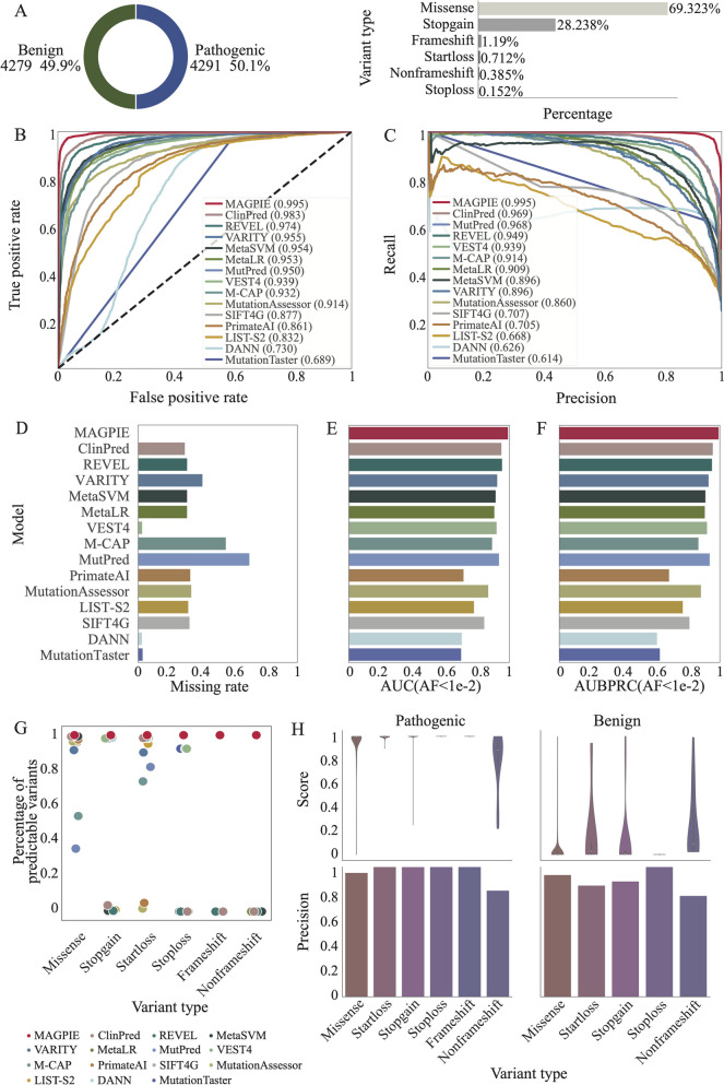
Fig. 3.
MAGPIE makes accurate predictions. A The pie chart showed the proportion of pathogenic and benign variants in the independent test set, and the bar plot illustrated the percentages of multi-type variants in the dataset. B The receiver operating characteristic curve of MAGPIE and 14 other predicted tools in the independent test set. The area under the curve (AUC) scores were shown in the bar plot. C Precision-recall curve of MAGPIE and 14 other predicted tools in the ClinVarTest dataset were illustrated. D Missing rate comparison of MAGPIE and 14 other predicted tools in the independent test set. The higher missing rate represented that the prediction tools cannot predict pathogenic scores on the larger number of candidate variants. E AUC comparison of MAGPIE and 14 other predicted tools in the ClinVarRare, which only included variants with AF < 0.01. F AUBPRC comparison of MAGPIE and 14 other predicted tools in the ClinVarRare which only included variants with AF < 0.01. G Percentages of predictable variants across different variant types in various tools. H Violin plots illustrated distributions of pathogenic scores. And bar plots showed the precisions in each category of pathogenic variants and benign variants

