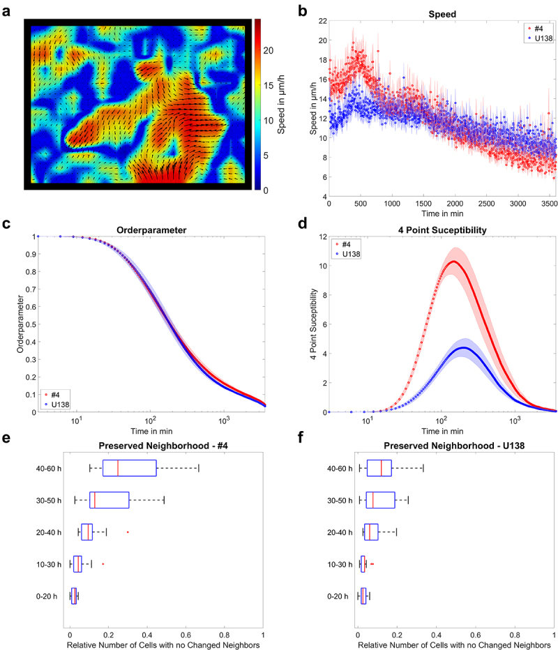
Figure 3.

Example of migration analysis. a) velocity field of U138 cells, showing streaming motion. b) mean instantaneous layer speed for two glioblastoma cell lines as a function of time. c, d) mean order parameter and 4-point susceptibility as a function of time. Peak positions of the 4-point susceptibility correspond to the average life time of collectively moving groups of cells. Error bars and shaded areas depict the standard error of the mean. e, f) quantification of changes in monolayer reorganization for different time windows after start of the measurement for both glioblastoma cell lines. Box plots show the median (red line), 25 and 75%ile (box), non-outlier range (whiskers) and outliers (red dots). Line plots: mean ± SEM for n = 3 and a total of 15 fields of view.
