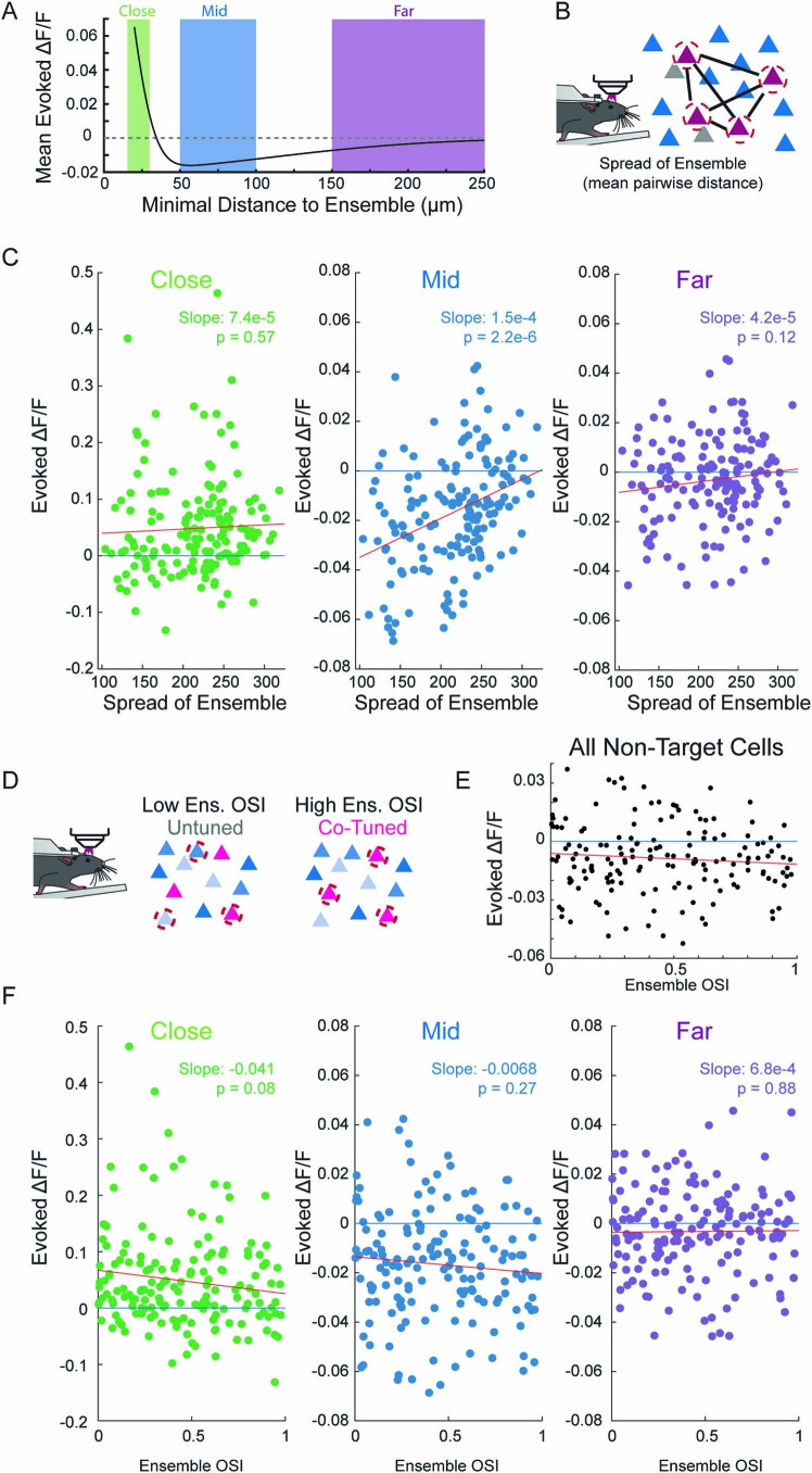
Extended Data Fig. 7. Correlation of population responses to ensembles statistics.
a: Non-target cells are categorized based on their proximity to a targeted cell as close (<30 µm, green), middle (50–100 µm, blue) or far (>150 µm, purple) cells. These categories are plotted against the predicted average response from Fig. 2a. b: Schematic showing the mean pairwise distance of a stimulated ensemble. c: Population averages of evoked fluorescence from non-target cells categorized as close (green), middle (blue), or far (purple) from a targeted cell as a function of the ensemble spread. Each dot is a population response to an ensemble, N = 160 Ensembles, 18 FOVs, 13 mice. Blue line 0 effect, red line linear regression fit. Slope and p value for the F-test of the linear regression model written on the plot. d: Schematic showing cotuned vs untuned ensembles. e: The evoked fluorescence from all non-targeted cells regardless of distance to a stimulated cell as a function of ensemble OSI (that is, tuning). f: As in c, but as a function of ensemble OSI.

