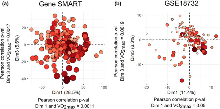
FIGURE 4.

Principal component analysis of individuals from the Gene SMART cohort at age‐related DMPs, and individuals from the GSE18732 cohort at age‐related DEGs. We used principal component analysis (PCA) to reduce dimensionality and show each individual on a two‐dimensional graph. Individuals from the Gene SMART cohort (a) and from the GSE18732 cohort (b) are colored according to their baseline VO2max levels. Lower levels of VO2max are indicated by smaller circles in lighter colors, while higher levels are indicated by larger circles in darker reds. To objectively test the clustering of individuals according to VO2max, we ran Pearson correlations between individual coordinates on Dimension 1, Dimension 2, or Dimension 3 and VO2max.
