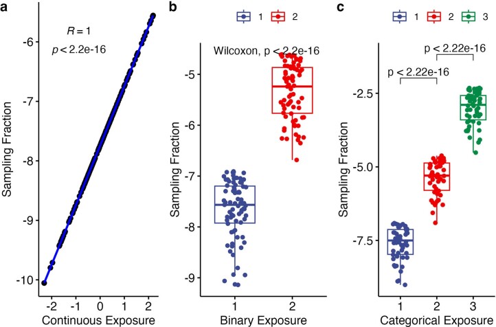
Extended Data Fig. 1. Illustration of batch effects in simulation studies where sampling fractions were programmed to correlate highly with the exposure of interest.
(a) Continuous exposure versus sampling fractions. Scatter plot for 150 simulated samples reveals the positive linear relationship between continuous exposure (X-axis) and sampling fractions (Y-axis). The regression fit is shown in blue. The strong correlation is emphasized by a Pearson’s R of 1 and a two-sided p value < 2.2 × 10⁻¹⁶(b) Binary exposure versus sampling fractions. Box plots detail distributions of sampling fractions (Y-axis) across two groups (X-axis) based on 150 simulated samples (75 per group). Each box signifies the interquartile range (IQR) of the data, the median is indicated by the interior line, and whiskers extend to the maximum and minimum values within 1.5 times the IQR from the box. Potential outliers are represented as points outside the whiskers, and jittered points indicate individual data points. A two-sided p-value < 2.2 × 10⁻¹⁶ from a Wilcoxon rank-sum test denotes significant group differences. (c) Categorical exposure versus sampling fractions. Box plots showcase distributions of sampling fractions (Y-axis) for three groups (X-axis) using 150 samples (50 per group). Each box, line, whisker, and point represents the same elements as in (b). Pairwise significant differences are denoted by two-sided p-values < 2.2 × 10⁻¹⁶ following a Wilcoxon rank-sum test.

