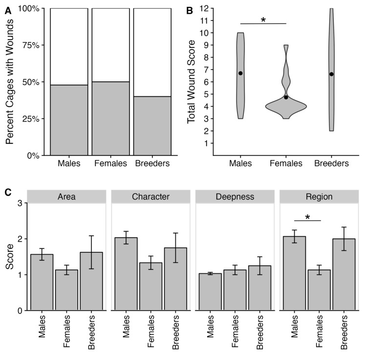
Figure 3.
Bite wound incidence and severity. (A) Stacked bar graph of the percent of cages with one or more wounds across the year. The grey color represents wounded animals, while the white color represents no wounds. (B) Violin plot of the total wound score for each housing condition. Females had significantly lower total wound scores than males (Z = −2.67, padj = 0.022). (C) Panel graph of bar plots for each wound severity metric for each housing condition. Each bar refers to the mean, while error bars refer to the standard error of the mean. Females had significantly lower region scores than males (Z = −3.14, padj = 0.005). The * refers to a significant effect with a p-value ≤ 0.05.

