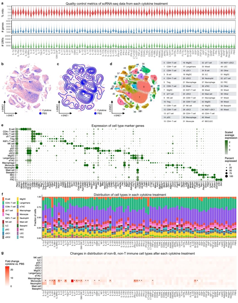
Extended Data Fig. 1. scRNA-seq data summary and quality metrics.
a, Violin plots showing the distributions of percentage of mitochondrial gene content (top), number of genes detected (middle), and number of unique molecular identifiers (UMIs) detected (bottom) per cell post-quality control across cytokine or PBS treatment conditions. The interquartile range is shown as a white box inside each violin plot. n = 386,703 independent cells over 272 independent mice (3 mice per cytokine and 14 mice for PBS control). b, Two-dimensional t-SNE visualization of all cells (following the coordinates in Fig. 1b), colored by any cytokine treatment (pink) or PBS control (blue). c, Contour plot of the t-SNE map in b. d, t-SNE visualization of all cells, colored by level-1 Louvain clusters identified from global clustering. The dominant cell type associated with each cluster is indicated in the accompanying table. Each cluster is further divided into level-2 clusters to refine cell type identification (Supplementary Table 2). e, Dot plot showing the scaled average expression of cell type marker genes and percentage of cells expressing the genes in each annotated cell type. f, Cell type composition in each treatment. g, Changes in the fraction of non-B, non-T immune cell types after cytokine treatment relative to PBS controls. * denotes P-value < 0.05, one-sided Wilcoxon rank-sum test with FDR adjustment. Only CD3– and CD19– immune cells are shown as these cell types are not influenced by the cell sorting strategy used.

