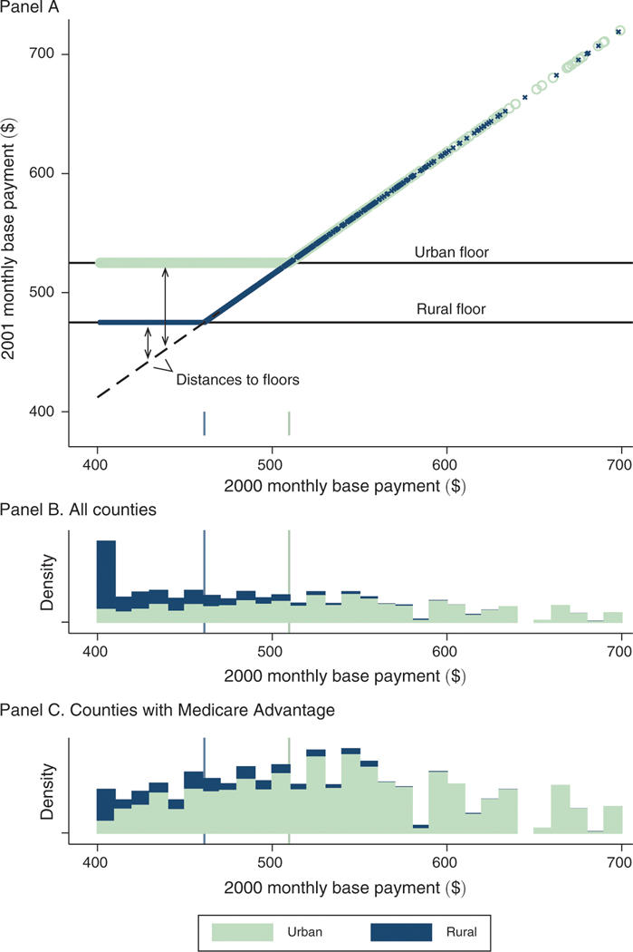
Figure 1. Payment Floors: Pre- and Post-BIPA Monthly Base Payments.
Notes: Figure illustrates the identifying variation arising from BIPA. Panel A shows county base payments before (-axis) and after (-axis) the implementation of the BIPA urban and rural payment floors in 2001. Urban counties are represented in light green and rural counties in blue. The dashed line in panel A indicates the uniform 3 percent increase that was applied to all counties between 2000 and 2001 and traces the counterfactual payment rule in absence of the floors. The distance to the floor defines our identifying payment variation and is a function of both the pre-BIPA base payment and a county’s urban rural classification. Panels B and C plot histograms of the base payments in 2000, stacking rural and urban counties and weighting by county Medicare population, for all counties (panel B) and for counties with an MA plan in at least one year of the 1997–2003 study period (panel C). All values are denominated in dollars per beneficiary per month. Base payments in this figure are not adjusted for inflation and are not normalized for the sample average demographic risk adjustment factor. The sample in the top two panels is 3,143 counties that include 100 percent of the Medicare population in 2000. The sample in the bottom is 880 counties that include 73 percent of the Medicare population in 2000.

