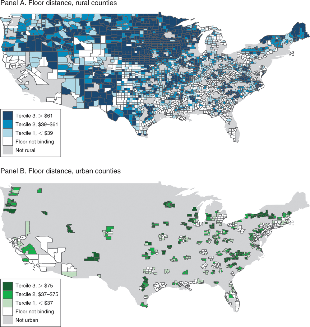
Figure 2. Effect of BIPA on County Base Payments.
Notes: Map shows the geography of the identifying variation across urban and rural counties. Counties are binned according to their tercile of distance-to-floor, separately for rural counties (panel A) and urban counties (panel B). Legends indicate the bin ranges, and counties for which the floors were not binding are shaded white. The distance-to-floor variable, which describes the payment shock between 2000 and 2001, is defined precisely in equation (2) and is graphically illustrated in the panel A of Figure 1. Base payments in this figure are not adjusted for inflation and are not normalized for the sample average demographic risk adjustment factor. Alaska and Hawaii are excluded from these maps but included in all of the other analysis. Inclusive of AK and HI, the sample is 3,143 counties that include 100 percent of the Medicare population in 2000.

