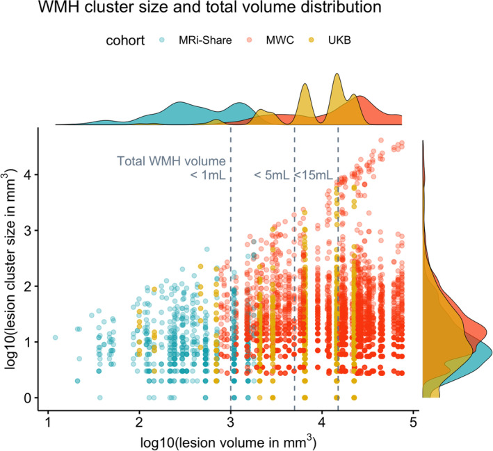
FIGURE 2.

Distribution of total lesion load and individual distributions of lesion‐cluster sizes in each subject with the manually delineated WMH in the three datasets. The x‐axis plots the log10‐transformed total WMH volume (in mm3) against the y‐axis showing the distribution of the log10‐transformed individual lesion cluster size (in mm3) in each subject, based on the manually traced WMH (i.e., each dot along the given x‐value representing the lesion clusters in a single subject). Colors indicate subjects from each cohort (MRi‐Share in turquoise, MWC in orange, and UKB in gold colors). Each subject is assigned one of five shapes randomly to separate data points coming from subjects with very close overall lesion volumes. Histograms on the margins show the distribution of the total lesion volume (top) or the lesion cluster size (right) separately for each cohort.
