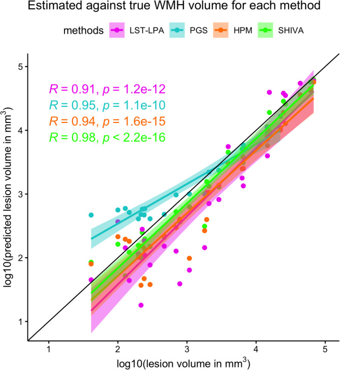
FIGURE 3.

Correlations between total white matter hyperintensity (WMH) volume of the manually delineated lesions and WMH segmented by each method across the test‐set subjects. The x‐axis plots the log10‐transformed total WMH volume (in mm3) based on the manually traced WMH against the y‐axis showing also the log10‐transformed total volume (in mm3) of WMH segmented by each method. Each dot along the given x‐value represents a single subject, with different colors indicating WMH volume estimates based on each method (LST‐LPA in pink, PGS in turquoise, HPM in orange, and SHIVA‐WMH in green). Regression lines with confidence intervals are also shown for each method in respective colors, as well as Pearson's correlation coefficients (R) between the log10‐transformed volumes and associated p values.
