
Fig. 5.
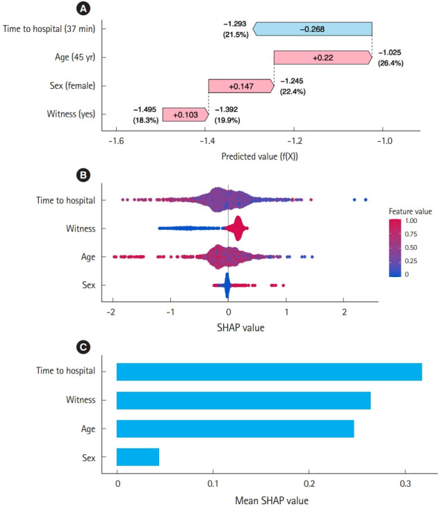
Example of Shapley Additive Explanations (SHAP) values. (A) The waterfall plot indicates the predicted value (i.e., f(X)) of each factor for a 45-year-old female who suffered cardiac arrest with witnesses and time to the hospital of 37 minutes. The change in predicted value from baseline (–1.495, corresponding to a survival rate of 18.3%) to that for this particular case (–1.293, corresponding to a survival rate of 21.5%) attributed to each factor is the SHAP value of each factor. The survival probability is calculated as the inverse logit function given by [1/(1+e(–f(X)))]. (B) The beeswarm plot demonstrates the SHAP values of each factor across all cases. A central vertical line (at SHAP value=0) indicates “no influence” on the prediction. If a point is to the right of this line, it means that the factor influences the model predictions in a positive direction (increases the survival rate); if it is to the left, it influences predictions in a negative direction (decreases the survival rate). The color of the dot represents the value of the factor. For example, red and blue correspond to female or male for sex and “witnessed” and “not witnessed” for witness status. Also, red or blue means older or younger in age. (C) The bar plot displays the absolute SHAP values, indicating that factors of time to hospital, witnessed status, and age are more relevant predictors of survival than age across all cases.