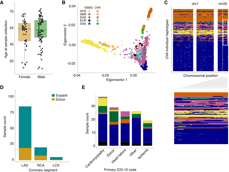
Figure 1.
Overview of patient and sample characteristics
(A) Boxplot showing the age range of study participants (y axis) in females and males (x axis; orange and green, respectively). Lines represent median, boxes represent interquartile range (IQR), and upper and lower whiskers represent 1.5 × IQR.
(B) Genetic ancestry principal components 1 (x axis) and 2 (y axis) mapped onto the 1000 Genomes phase 3 reference population (bold color dots), with color corresponding to Gencove-assigned majority ancestry in our samples (lighter color dots with black outline).
(C) Local ancestry inference reveals a complex genetic substructure for individuals with ancestral admixture, with each row in the plot representing inferred local ancestry for one haplotype of one study participant and x axis representing position on respective chromosomes. Inset, zoomed in region on chr 20 showing genetic substructure for a subset of the individual haplotypes.
(D) Number (y axis) of coronary artery segments by type (x axis) used for RNA isolation in samples from explants (turquoise) and rejected donors (gold).
(E) Number (y axis) of coronary artery segments by primary ICD-10 code diagnosis for explanted hearts or donor hearts. Samples were grouped into main categories listed in Table S1.

