Figure 3.
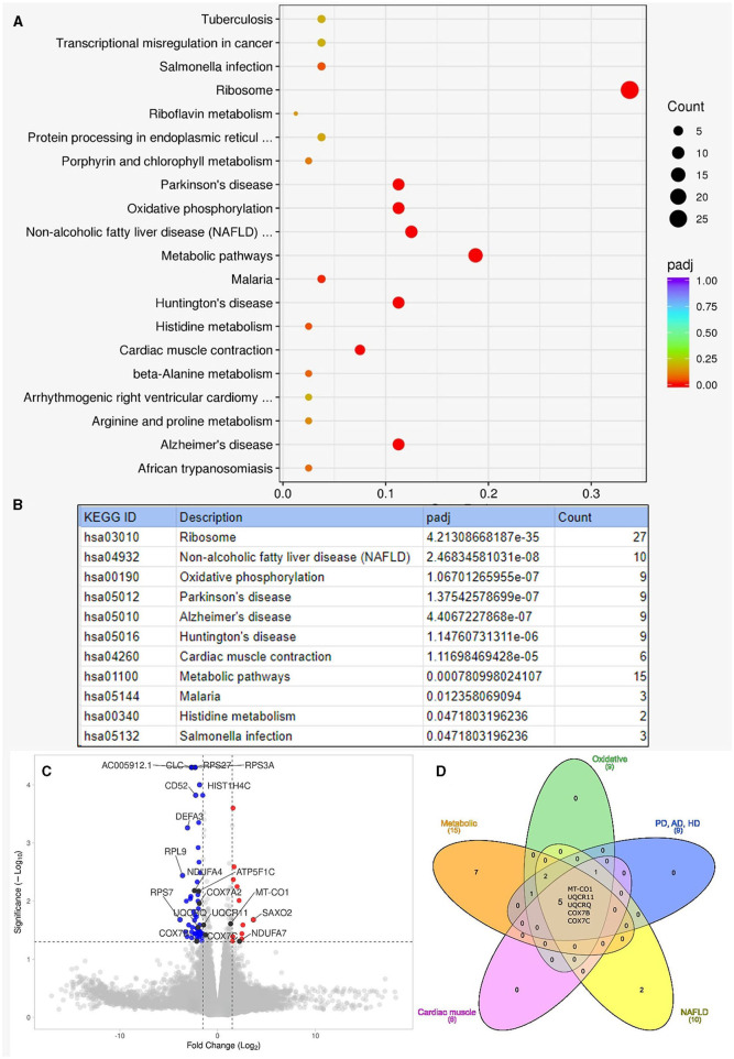
Results of enrichment analysis. (A) Shows the summary result of the enrichment analysis. On this enrichment scatter plot, the y-axis shows the pathway's name, and the x-axis shows the rich factor. Color represents the adjusted p-value and the size of the circle of the gene count. Rich factors refer to the ratio of DEGs number in the pathway and the number of all genes annotated in the pathway. (B) Lists the pathways that showed significant enrichment among the Kyoto Encyclopedia of Genes and Genomes (KEGG) pathways with adjusted p-values (padj). “Count” is the number of genes detected to be differentially expressed on the given pathway. (C) Shows the volcano plot for the enrichment analysis. Altogether, 162 genes were differentially expressed: 54 upregulated and 108 downregulated with moderate log-fold changes. Dashed lines indicate the thresholds for fold change (−1.5, 1.5) and -log10p-value (1.3). Red dots are upregulated, and blue dots are downregulated genes. We indicated the top 10 genes according to Manhattan distance, plus the 9 mitochondrial genes with black dots. A volcano plot was generated with the VolcaNoseR (26). (D) Shows the overlapping differentially expressed genes among different pathways. The Venn diagram was generated with the InteractiVenn (27). AD, Alzheimer's disease; HD, Huntington's disease; NAFLD, non-alcoholic fatty liver disease; PD, Parkinson's disease.

