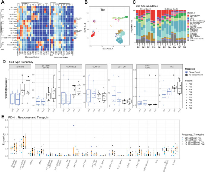
Fig. 2.
a Heatmap showing cluster population definitions. b UMAP dimensional reduction of mass cytometry data, color coded by cluster cell populations. c Stacked barplot showing frequency of each cell population in each patient sample. Legends for B and C shown in figure C. d Boxplot showing frequency of specific cell populations pre- and post-treatment for both response groups. e Arcsinh transformed expression of PD1. Median and interquartile range shown in orange

