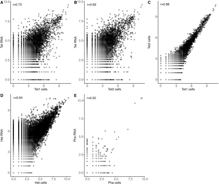
Fig 3. Scatter plots illustrating correlations between sequencing libraries.
Each circle represents one gene, and its position indicates its total counts (number of unique transcripts) in the two libraries compared. A-C) T. thermophila. Bulk RNA added to the array vs. MASC-seq data (cells) for Tet1 (A) and Tet2 (B). MASC-seq data for Tet1 vs Tet2 (C). D) Bulk RNA added to the array vs. MASC-seq data for Heterocapsa sp. E) Bulk RNA added to the array vs. MASC-seq data for P. tricornutum. Pearson correlation coefficients (r) are given for each subplot.

