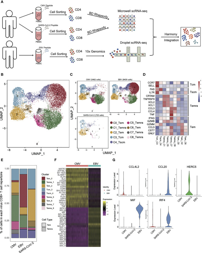
Figure 1.
The landscape of CMV-, EBV-, and SARS-CoV-2-specific CD8+ T cells. (A) The pipeline for sample collection, treatment, and single-cell RNA-sequencing data preparation. (B, C) The UMAP figure of all CD8 cells from three different viruses; merged together in b and shown separately in c. The total CD8+ cell number for each of viruses was shown above each panel. The color denotes different cell clusters as the legend shows. (D) The mean expression of each gene in each cell cluster is presented in different colors, as shown in the legend color bar. The values were row scaled. The marker genes for different cell types were listed on the left. (E) The proportion of different cell clusters in the T-cell repertoire primed with different viruses is displayed in a stacked bar plot. The different colors represent different cell clusters the same as in figure (B, C). The pattern of the bar indicates the cell types listed in the legend. (F) The top 20 DEGs between CMV and EBV Temra found by the “findMarker’ program are shown with the heatmap. Each row represents one gene, and each column represents one cell. The color is the expression value of a given gene in the given cell. (G) The top DEGs among CMV, EBV, and SARS-CoV-2 Tems. The expression for each gene in each cell is present with the violin plot. The red one is cells from CMV-primed, the green one from SARS-CoV-2 primed, and the blue one from EBV-primed.

