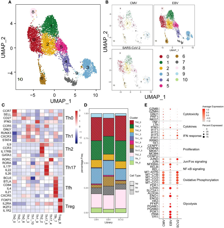
Figure 3.
The landscape of CMV-, EBV-, and SARS-CoV-2-specific CD4+ T cells. (A, B) The UMAP figure of all CD4 cells from three different viruses, taken together in (B) and shown separately in (C). The color denotes different cell clusters as the legend shows. (C) The mean expression of each gene in each cell cluster is presented in different colors as shown in the legend color bar. The values were row scaled. The marker genes for different cell types were separated with gap rows. (D) The proportion of different cell clusters in the T-cell repertoire primed with different viruses is displayed in a stacked barplot. The different color represents different cell clusters the same as in a-b. The pattern of the bar indicates the cell types listed in the legend. (E) The expression for the marker genes of different functions is shown in the dot plot. The size represents the percentage of cells with non-zero expression in given genes (row) and given cell clusters (column). The color is the average expression, as denoted in the legend.

