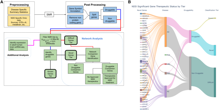
Figure 1.
Graphical representation of research workflow and results
(A) Graphical representation of the general workflow used in conducting our analyses. NDD, neurodegenerative disease; SMR, summary-data-based Mendelian Randomization. (B) Graphical summary of results. Sankey plot depicting the flow of candidate genes into their respective tier. On the left, we highlight novel genes, but the remainder of the plot visualizes all 159 candidate genes regardless of the final classification tier. Note: the size of each novel gene node is scaled to represent the number of significant SNPs for the associated gene probe-disease pairing.

