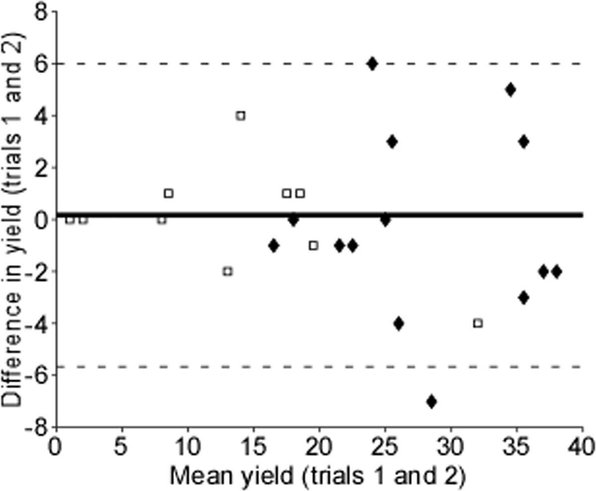
Fig. 2. Bland-Altman plot.

The difference in motor unit yield is plotted against the mean yield of each subject (open squares represent females, solid diamonds represent male subjects). The solid line represents the mean difference, and the dashed lines represent two standard deviations.
