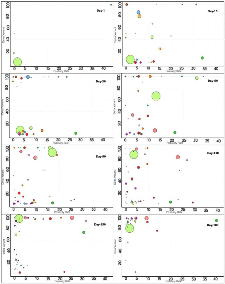
Figure 5.
Time series analysis between the Delta variant vs. positivity rates across the world. The X-axis represents the positivity rate and the Y-axis indicates the incidence of the Delta variant. Each bubble represents a country with its size representing the population and the bubbles are color-coded by country (i.e., fluorescent green: India, blue: Pakistan, purple: United Kingdom, red: Japan, yellow: France, pink: Thailand, rust: Vietnam, peach: Indonesia and so on). The visualization link to generate this figure is https://ccc.icmr.org.in/delta/delta/.

