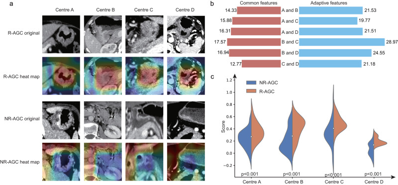
Fig. 4. RFLM Algorithm Result Analysis Diagram.
a The heatmap shows the information acquired by the RFLM for images in the recurrent and nonrecurrent classes. The red areas indicate a high level of model attention, while the blue areas indicate a low level of model attention. b The Euclidean distance plots depict the distance between the common and adaptive features of the four central data points. The left side represents common features, while the right side represents adaptive features. c The score charts illustrate the positive and negative images of the four data centres evaluated by the RFLM. Statistical test: Independent t-test (two-tailed). RFLM robust federated learning model, NR-AGC no recurrent advanced gastric cancer, R-AGC recurrent advanced gastric cancer, p significance value.

