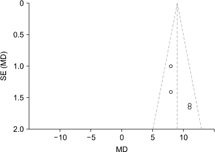
Fig. 5.
Funnel plot conducted using RevMan to analyse publication bias, of which shows that there is a possibility of publication bias due to the asymmetry of the data points for the QIDS baseline and 5/6 weeks post intervention scores. The dotted lines represent the 95% confidence intervals while the middle vertical line is the overall effect. Each study is represented by a dot, with the standardised MD result plotted on the x-axis, and their precision/standard error (SE) on the y-axis.
MD, mean difference; QIDS, Quick Inventory of Depressive Symptomatology.

