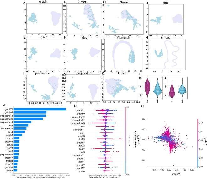
Figure 5.
Sequential feature analysis. (A–K) Comparison of the characteristics of SARS-CoV-1/2 coronavirus circRNA and human circRNA. (L) Violin plot to visualize feature distribution. (M) The 20 most important features. (N) Summary plot for SHAP values. For each feature, one point corresponds to a single sample. The SHAP value along the x-axis represents the impact that feature had on the model’s output for that specific sample. Features in the higher position in the plot indicate the more important it is for the model. (O) SHAP dependence plots. These plots show the effect that a single feature has on the model predictions and the interaction effects across features. Each point corresponds to an individual sample, the value along the x-axis corresponds to the feature value.

