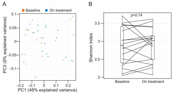
Figure 1.
(A) Projection of the first and third principal components (PC) of the principal component analysis model. We chose to represent PC1 and PC3 as it provides a clear visualization of the results obtained from the PERMANOVA analyses. However, PC2 and PC3 explained a similar portion of the variance in our dataset, 13% and 9%, respectively, and we obtained a very similar plot when representing PC1 and PC2 (see Figure S3). Each dot represents individual fecal specimens, which are colored based on whether they were collected at baseline (orange) or on treatment (blue). (B) Boxplots showing alpha diversity metrics (Shannon index) in paired fecal samples. Samples collected from the same subject are connected with straight lines. For statistical inference, we used a paired t-test, and the observed p-value is shown in the graph.

