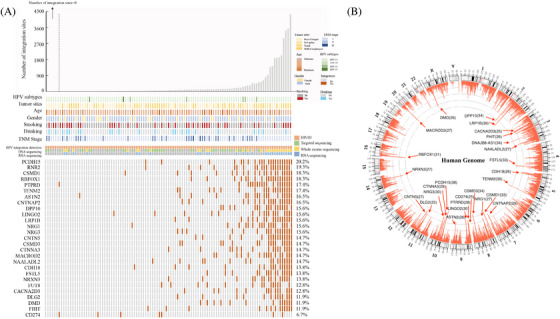
FIGURE 1.

Landscape of HPV integration on the host genome. (A) Clinical annotation of HPV integration across 109 samples. Each vertical track represents an individual sample. The upper histogram depicts the count of HPV integration sites in each sample, and the middle heatmap presents clinicopathological patient information and detection methods used for each tumour. The bottom heatmap shows distribution of recurrent integration sites across different samples, with numbers indicating integration frequencies in genes being integrated across 109 samples. (B) Distribution of HPV integration sites in the human genome (hg 19) among 103 samples with viral integration. Each bar of outermost circle denotes integration position into the human genome. Red bars of the inner circle indicate integration frequency at specific loci, with higher frequency sites highlighted for reference, and the histogram axis units represents number of integration.
