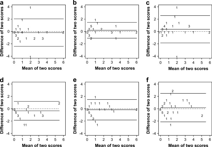
Fig 2.
Bland–Altman plots for the palpation scores of the same thyroid gland lobe between clinicians. (a–c) represent T1 and (d–f) represent T2. In (a) and (d) the difference between clinicians 1 and 2 is depicted. Similarly, (b) and (e) refer to the difference between clinicians 1 and 3; and (c) and (f) refer to the difference between clinicians 2 and 3. The X-axis shows the mean of the two scores, whereas the Y-axis shows the difference between the two scores. The numbers on the figure represent how many times a specific combination occurred. The horizontal lines on the figure correspond with the mean difference in score (middle horizontal line) and the 95% CI (upper and lower horizontal line). The dotted horizontal line corresponds with a zero mean difference in score.

